This is a project about age ratings and looking into if they have become pointless. I am looking at lots of online videos and resorces about youtube and other media. These are some of the video sources that I am using in this project to get my points across.
This is a project about age ratings and looking into if they have become pointless. I am looking at lots of online videos and resorces about youtube and other media. These are some of the video sources that I am using in this project to get my points across.
I added a backing track but felt like it didn't change enough on when it has nightmares, so I decided to add sound effects to my final piece.
I decided that I wanted it to end sharper so I added the TV clicking off as it fades quicker and have made it sharper with just ending with 'Research before watching' instead of 'Look Before watching, Research Before Watching'.
This was my first animatic that I produce when trying to think of the script, it didn't work to well because I didn't have a script to go to.
After my first animatic I produced a script and this is the beginning of the way I wanted to work, although I did take a lot of inspiration from the american express adverts and the way they transform objects.
I wanted to see what the sketchy animatic would look like as a final design and I though it worked well although I felt it didn't flow to well. When looking back on this I felt this was me trying to make a animation that went well with the american express look, it didn't have much of the illustrative style that I like and like to produce. I felt this was a good experiment even though I didn't end up using this in my final piece.
I was looking at the way things move and morph in this video, I also like how this is very clean and slick. I think this works well and although it is not on the same subject I think this works for explaining things swiftly. I also like the use of both thin and thick lines as a contrast, I think although they don't use colour I think the use of the contrast of lines works well without colour.
I wanted to look into backgrounds and this is a good example, I like the use of the paper effect but also the way they transition. I think the use of simple colours works for this as it has a dark coloured paper background, I think this could work if I didn't have any colour but as I have some colours I feel this couldn't work. Although I think that some subtle effect could work well and just have a small amount as opposed to having it so prominent.
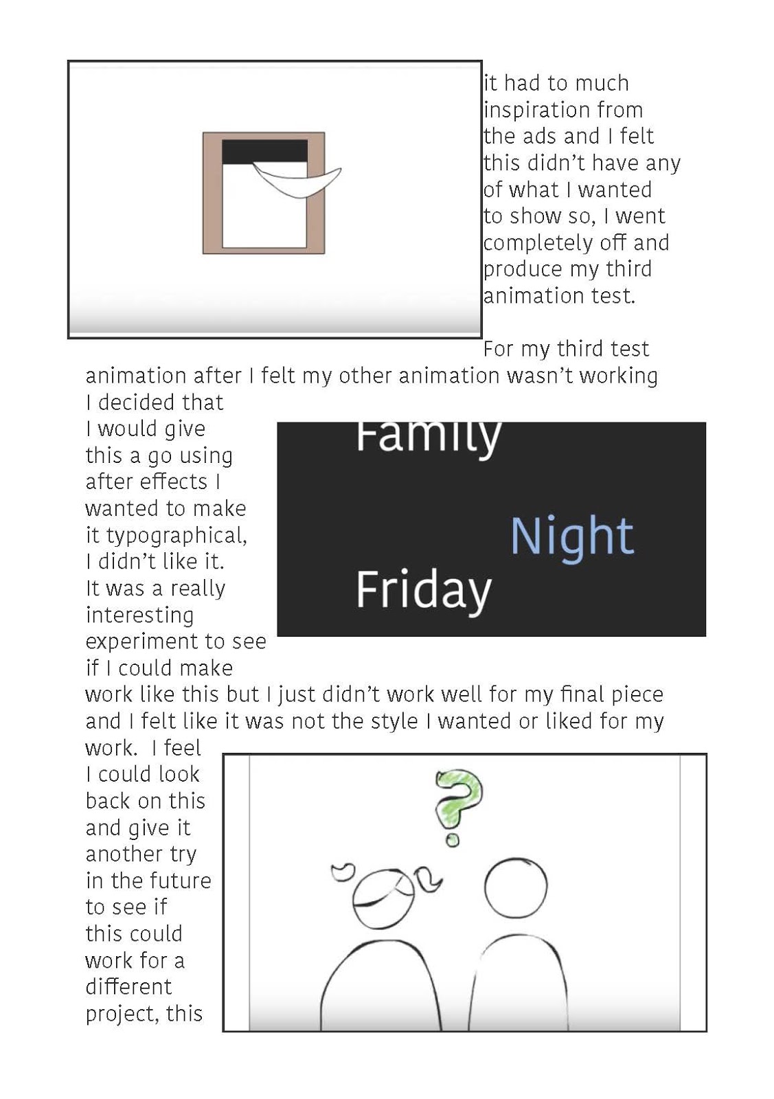
When my other animation wasn't working I decided that I would give this a go using after effects I wanted to make it typographical, I didn't like it. It was a really interesting experiment to see if I could make work like this but I just didn't work well for my final piece and I felt like it was not the style I wanted or liked for my work. I feel I could look back on this and give it another try in the future to see if this could work for a different project, this was just not what I was going for in my final piece.
YukaiDu Showreel from Yukai Du on Vimeo. Although this is a showreel I think there are quite a few effects that could be used, I think the constant movement is well done throughout. I have looked at a few as I said in others but this animator I like the movement they add to each section to make the piece more organic.
VIVIAN GIRLS from Sol Lee on Vimeo. When looking at this animation I was looking at the soft colours and they movements, I like the us if the block colours but I feel this wouldn't work well for mine as it is to soft for the message I am trying to represent. I like the use of the soft pastel colours in the piece, I feel like I should try this to see if it works for my piece.
NETFLIX SPOT from Sol Lee on Vimeo. I was looking at the textures in this video as well as the clashing colours. I feel like this is a good way to create contrast in animations, I like the texture that the animator has added to this image as it give a lot of interest to look at.
I used this as inspiration for the line work as I felt like this would work better than using complicated images, I felt this work better and has more of a childlike feel to the piece. I felt like this worked because of the simple shapes and limited colour scheme. I also liked they way this has a clean background and I felt this worked really well for this piece, I am going to look into using a simple background for my animation.
BBC Sport Rugby World Cup from Yukai Du on Vimeo. With this animation I like the movement throughout and how they transform one scene to the next, they have also kept constant movement throughout which I think works well. I like this style of simple animation and think this works well as the most detailed bit is the focal point. By using the simple shapes around it does make you focus more on the central point.
This is a simple animation but I like how they have simple movements that catches your attention. Although this is a simple animation I think that works with the sharp cuts between the scenes, the small movements help bring this animation together and keeps the piece flowing.
Although this is a video the animation is interesting and they way it transforms from one image to another has a concent flow. I like how some of the images melt away whereas others transform, this keeps the audience interested. I also like the use of the simple colour schemes of the blues as I feel like this adds to the mood of the video.
UnitedHealth Group - 'Connections' from Gentleman Scholar on Vimeo. The use of the objects as well as line animation together create an interesting visual look to the piece, by linking the blue colours together it creates more of a theme to the piece. I also like the way it flows from one image to another with both sharp cuts and tracking shots, this works well for this piece.
A Tale of Two Zip Codes from BLACKMATH on Vimeo. In this animation I like how they use the lines as well as the solid shapes, what I also like and want to take inspiration from is the use of the constant movement. At the beginning of the animation it has a organic feel with the movement being fluid making the images softer.
This is the advert Hershey Kisses and Nat Geo Wild produced for mothers day, I was looking at this animation for the for the way they move from one scene to the other. I find it also interesting in how they have brought the visuals for both Nat Geo Wild with all of the animals but also the point of it being mothers day and to give 'kisses'. I also looked at other videos by Sol Lee, I like the way she gives texture and movement throughout and I think by giving it movement it will make it more organic and more the style I am going for.
I was looking into they way people look at the visuals of animations and found this updated Powerpuff Girls Theme tune. This is the theme for the 2016 update of Powerpuff Girls which they have made more 'edgy' and they didn't just update the visual. I think this works well as they use both the old and new to have both audiences, they use the old theme at the beginning before going into the new. I feel like this works well and the visual and audio works well together and I feel this is something I have to think about what I have to use to join them together, but still keeping my own style.
When looking at this animation i found it really interesting in the way it transforms from one image to another. I also like the soft colours used, but it is also the way it just uses the 4 colours throughout. The way it goes with the voice that it has used and also it has the small sounds which work well for this piece but I am not sure it would work for my final piece. It does represent the work that Garance Dore illustrative work, I think this is a good way to show a link between the visual and the audio.
I also wanted to look into the different areas and how they show childlike subjects in a darker tone. I found Melanie Martinez who's latest album Cry Baby has a narative and throughout her album booklet she has a narrative about a girls life, which although the songs are quite childlike tunes can turn very dark. One of the songs I looked at called Dollhouse is about how things can look from the outside them on the inside can be completely different. This is the page from the booklet for the song Dollhouse, she creates the children book sound throughout the book as the words rhyme and make it more sing song. This is only one of the elements of the piece as the songs make up the narative of a very sad life of a little girl with issues.
I think this is a interesting way to display your songs and as they all join together it makes it even more interesting, even with the childlike song names it can be very deciving. This is shown in the example called 'Mad Hatter' which uses characters from Alice Adventure in Wonderland but an extract from the song using these chacters and scenarios:
We paint white roses red,
Each shade from a different person's head
This dream, dream is a killer
Getting drunk with the blue caterpillar
I'm peeling the skin off my face
'Cause I really hate being safe
The normals, they make me afraid
The crazies, they make me feel sane
Another example is:
All the best people are crazy
All the best people are
Where is my prescription?
Doctor, doctor please listen
My brain is scattered
You can be Alice,
I'll be the mad hatter.
This is a example of how you can change something to make it much darker and this doesn't have any swearing in it.
I was looking into how to change the mean of things or looking at things from another perspective. I wanted to see how people view different things and making a child like things I found this video in wich Jonathan Charles Cozart who was creating videos on youtube to show Disney and what it could be. I found this a very interesting was to look at it and this is what the stories turned into after the 'cameras' are turned off. It looks more into what could have happened to a selection of the princess, there are 2 of these videos with 8 princesses including Elsa, Ariel, and Mulan. Looking at the movies he goes on to the after ever after for example Ariel has been drowned in oil and Mulan has a sex changed after dressing like a guy for months. This is something more of an adult mind looks into but this is just showing how things can become dark and twisted even with the most innocent content. In some of the cases such as Pocahontas, they do actually go into the issues of that happen in the past and bringing it into the Disney 'World' he has done this by going into more of the darker side of the innovations of American and what happened in these times.